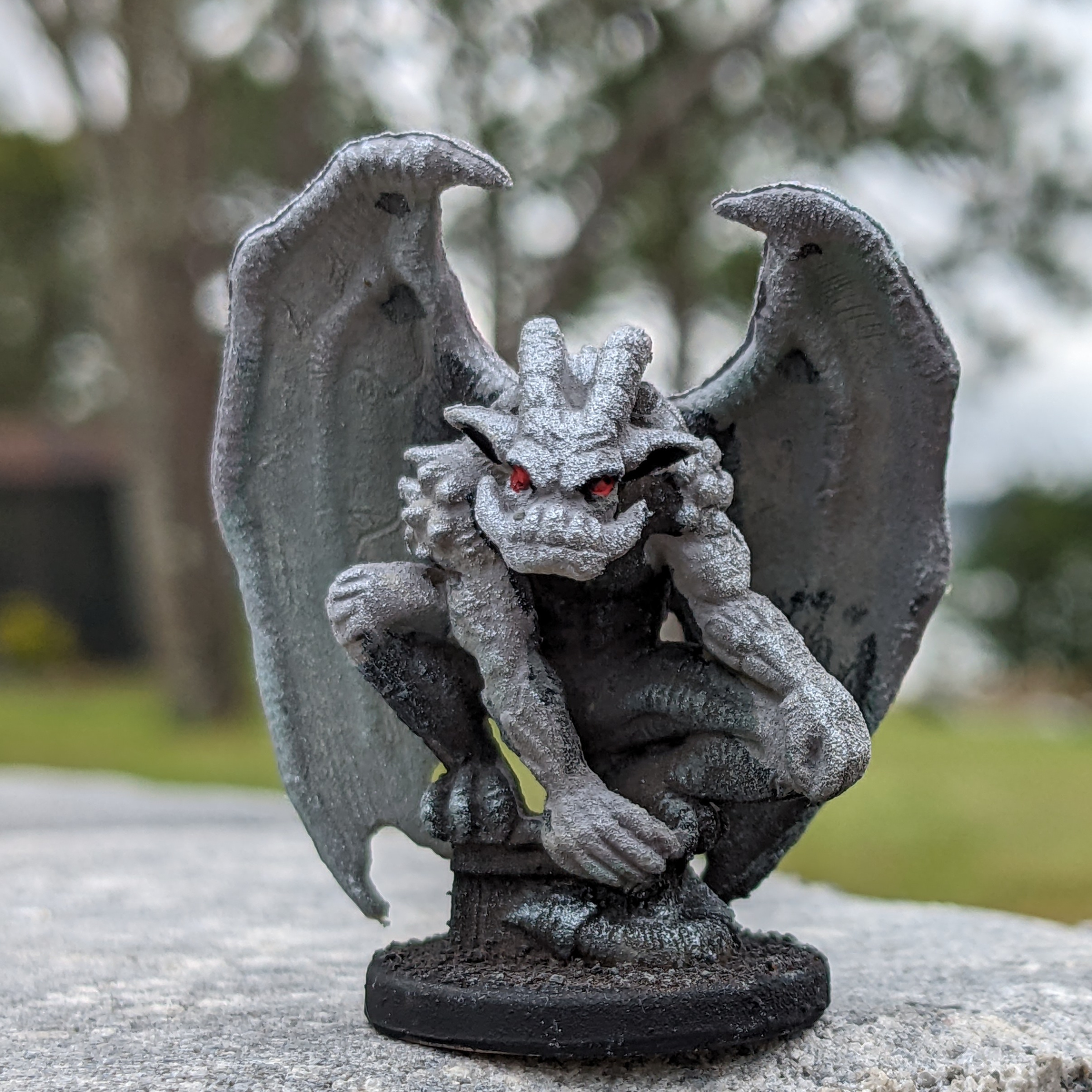
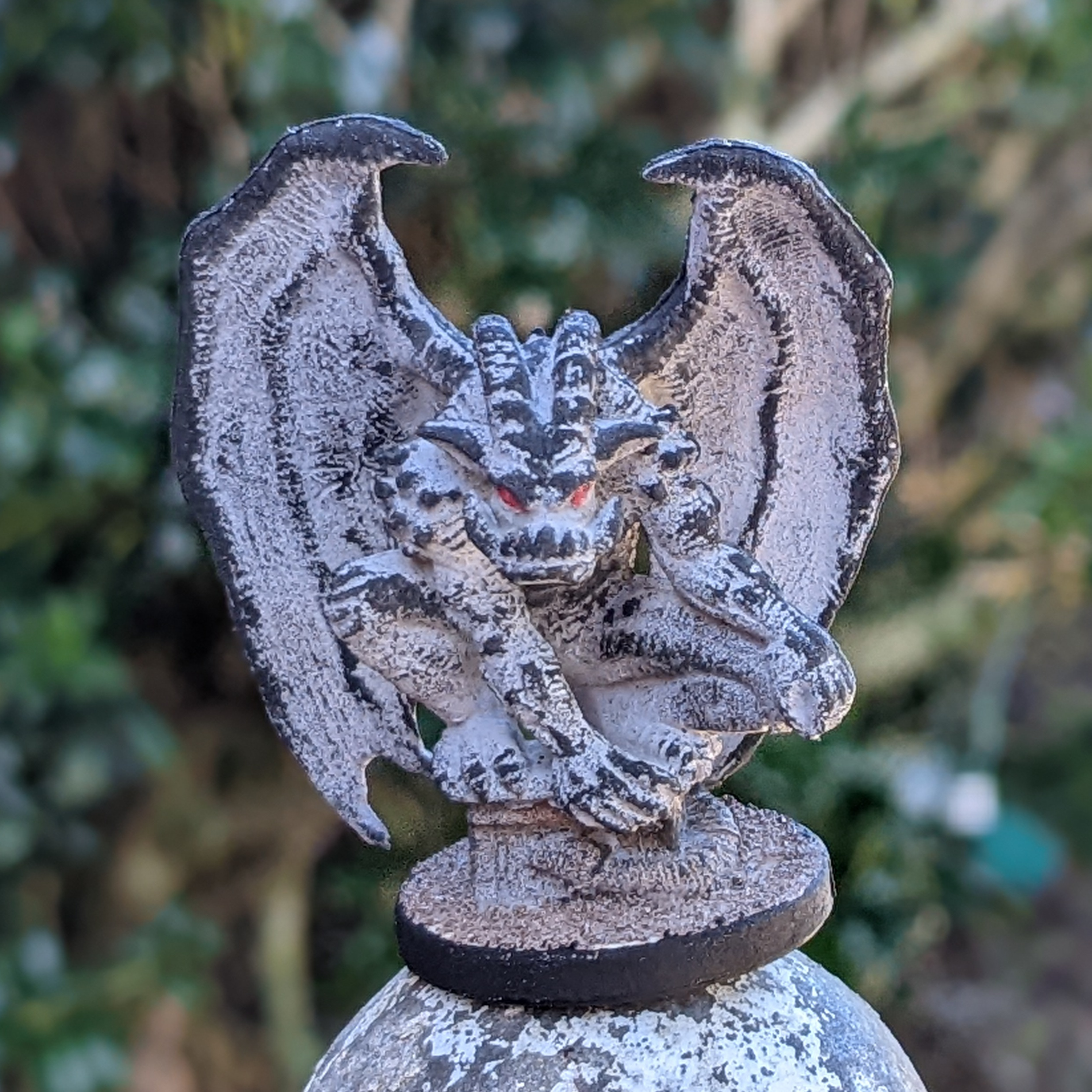
This is the gargoyle miniature from the Castle Ravenloft board game, painted. It took me three tries to get an effect I was fully happy with, mostly because I tried to use a gray primer instead of a black primer. (More on that later on….)
First, I glued sand to the top of the base, as it had a large flat area that was a bit boring around the stone “bench” the gargoyle is sitting on.

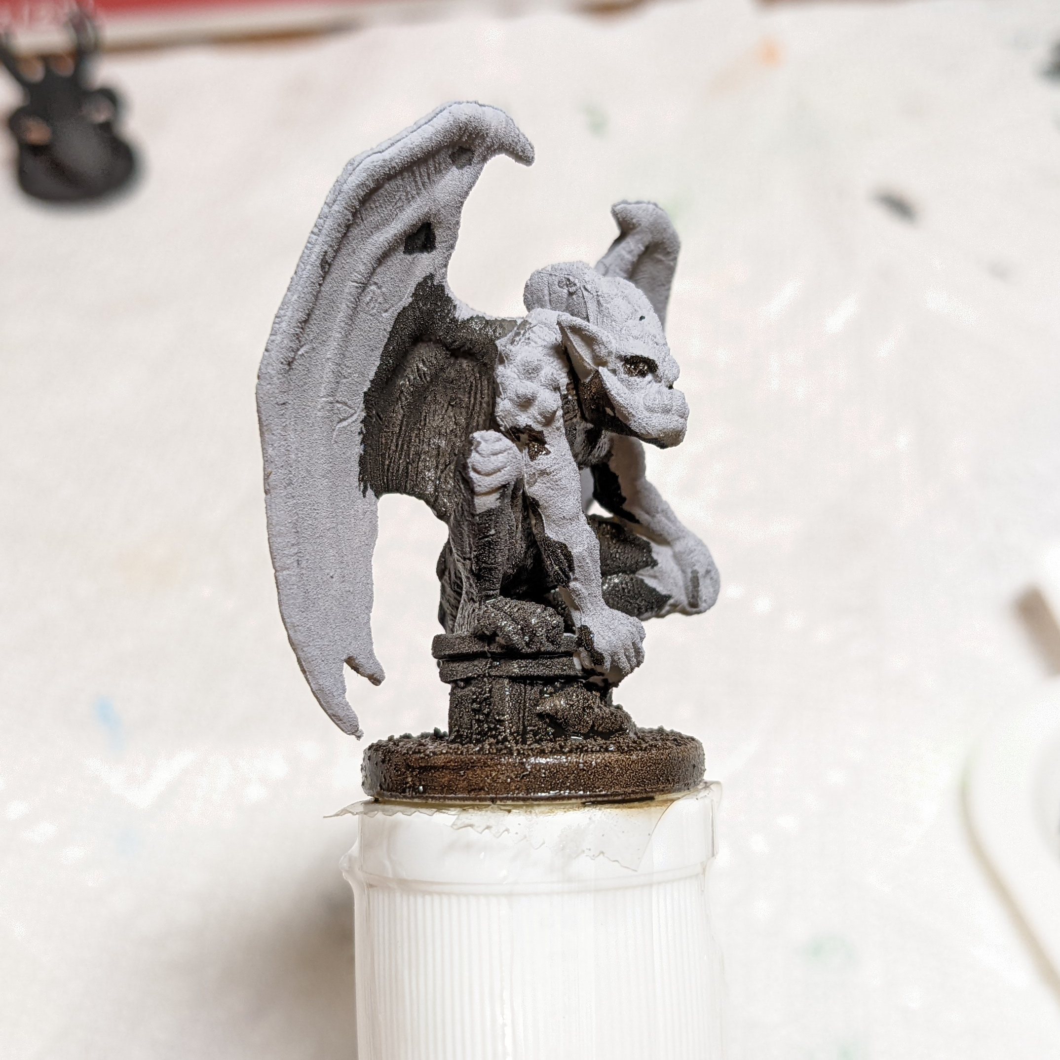
Then, I used an automotive gray spray primer to prime the plastic (and help lock the sand in place). If you paint the eyes red, you can get away with calling this done, as the gray primer really looks like stone.
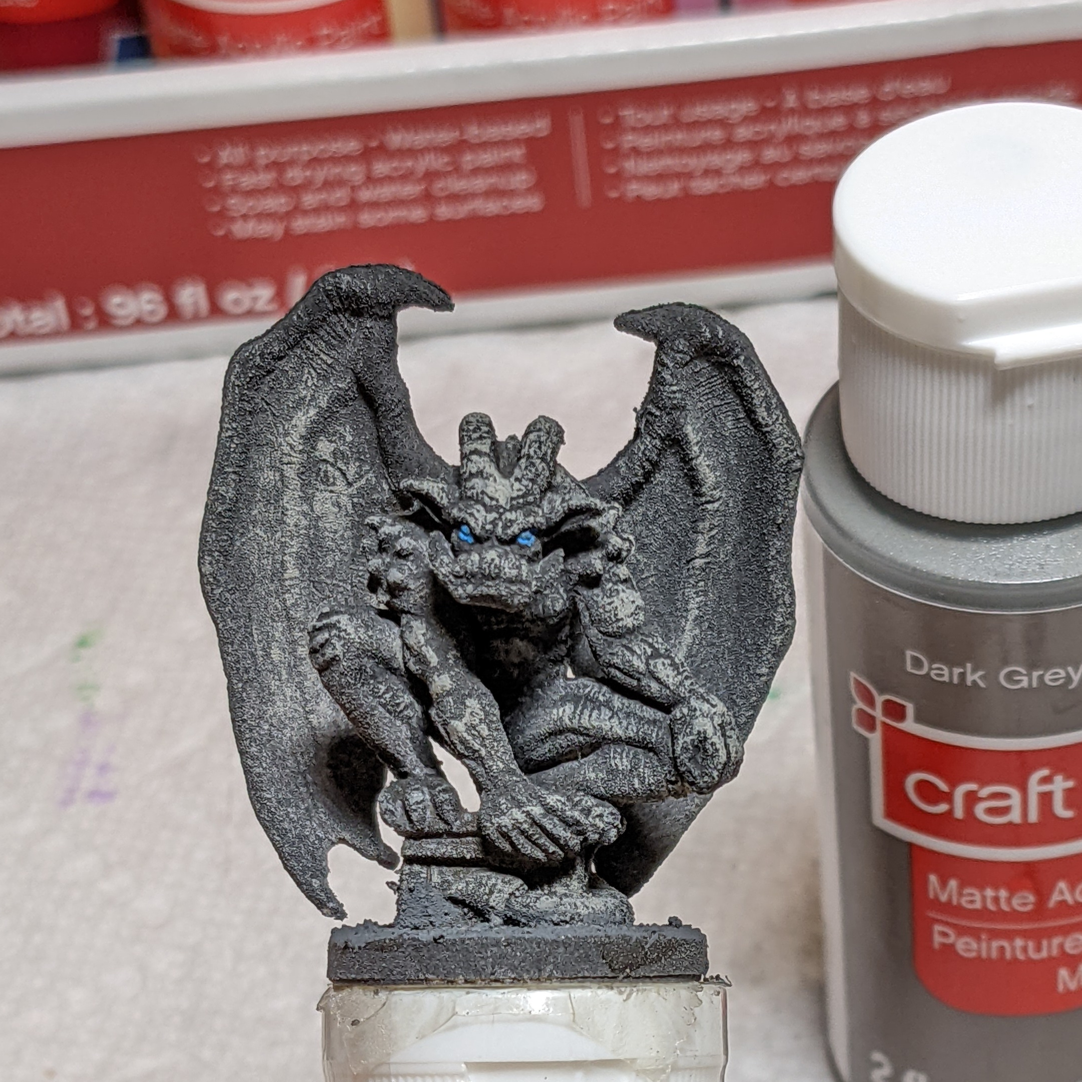
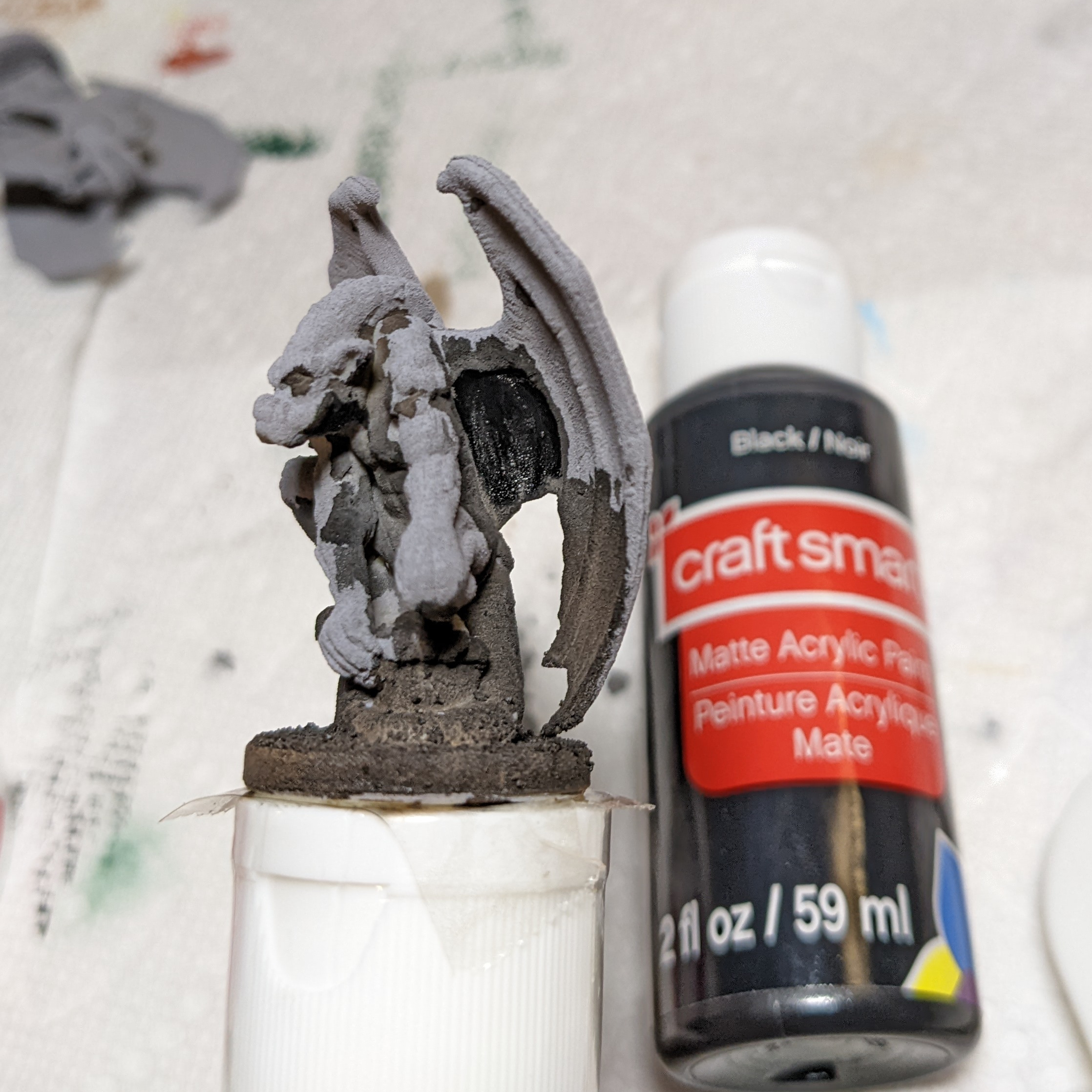
The only problem of course is that it has no real contrast. I tried two different ways of painting the figure with the gray primer, and although they look OK (I’ll show you them below) I wasn’t able to really make it pop until I re-primed the figure using a flat black, so that is where we will start.
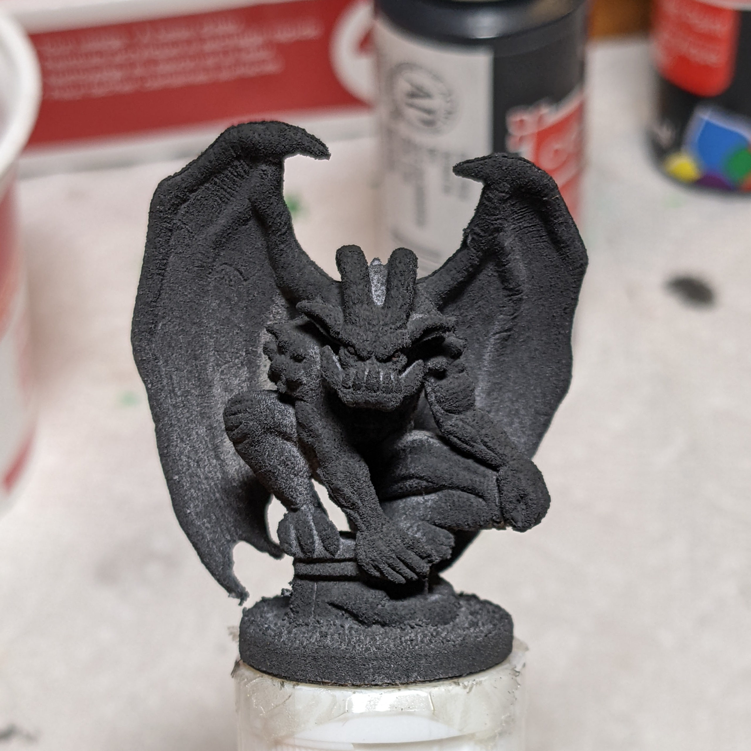
As you can see, I went relatively light on the black primer, as I didn’t want to loose detail under a lot of paint, so the gray is showing through in a few places. Just more visual interest. I will be painting the figure using only shades of black and white (dark gray, gray, pearlescent white), so I’m going to apply an ink wash of transparent burnt umber to the base, “bench” the gargoyle is sitting on, his lower tail and the back half of his body behind the wings (as well as his spine on the outside of the wings). On the base, this suggests “dirt” or “earth” and separates the base/bench from the gargoyle figure, and it also darkens the most shadowed part of the gargoyle.
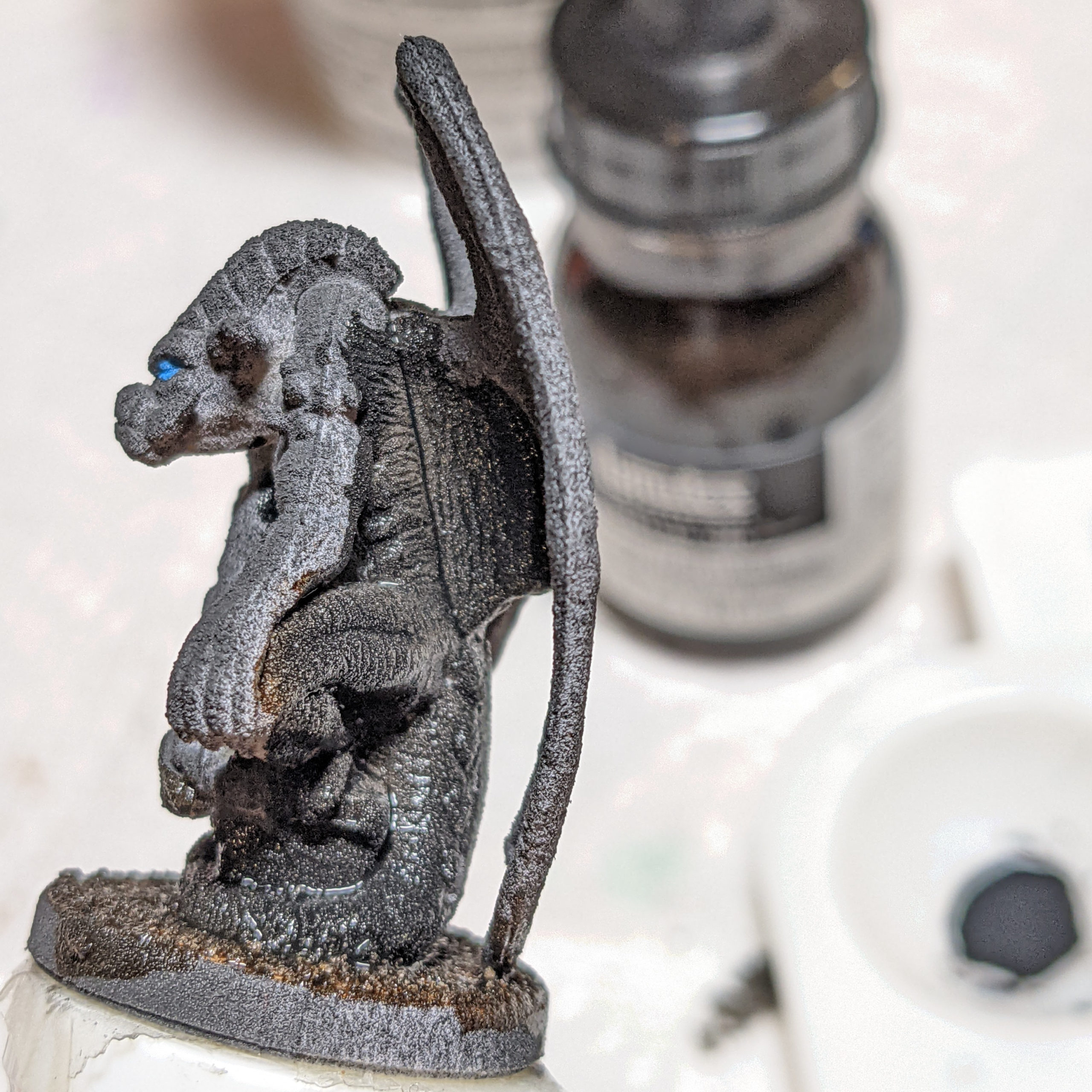
Then, I dry-brush the gargoyle in a mostly downward direction using dark gray. I get a little dark gray on just about the whole figure to bring out the texture, including deep inside the chest/torso area and even the back sides where the burnt umber wash was.
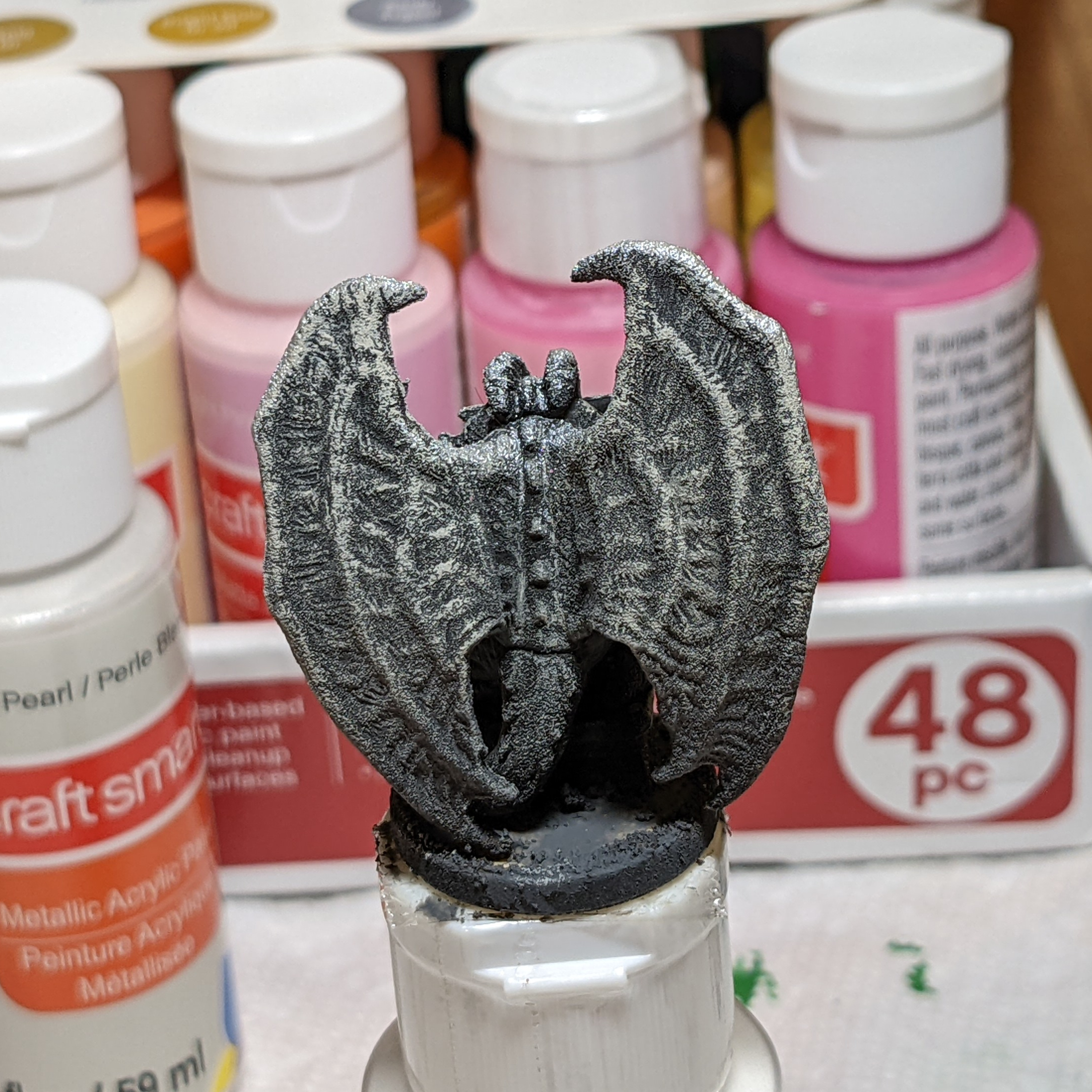
I then concentrated more on the front and top of the figure for a bit of highlighting effects, but most of the highlights will be done in the next two colors. (For example, I didn’t bother putting a lot of dark gray on the top edges of the wings, as I knew I would be hitting them heavily in the next two steps.)
After the dark gray, I dry-brushed gray, focusing on the tops of the wings, veins in the wings, top of the horns, front of the face, and all down the front/outside of the body and arms/legs/knees that would be hit by light. We now have most of the contrast visible, going from the dark black primer through the dark gray mid-tones, and into the gray highlights. Of course, “gray” isn’t a color you normally think of as a highlight, so there is still room to brighten up the brightest highlights.
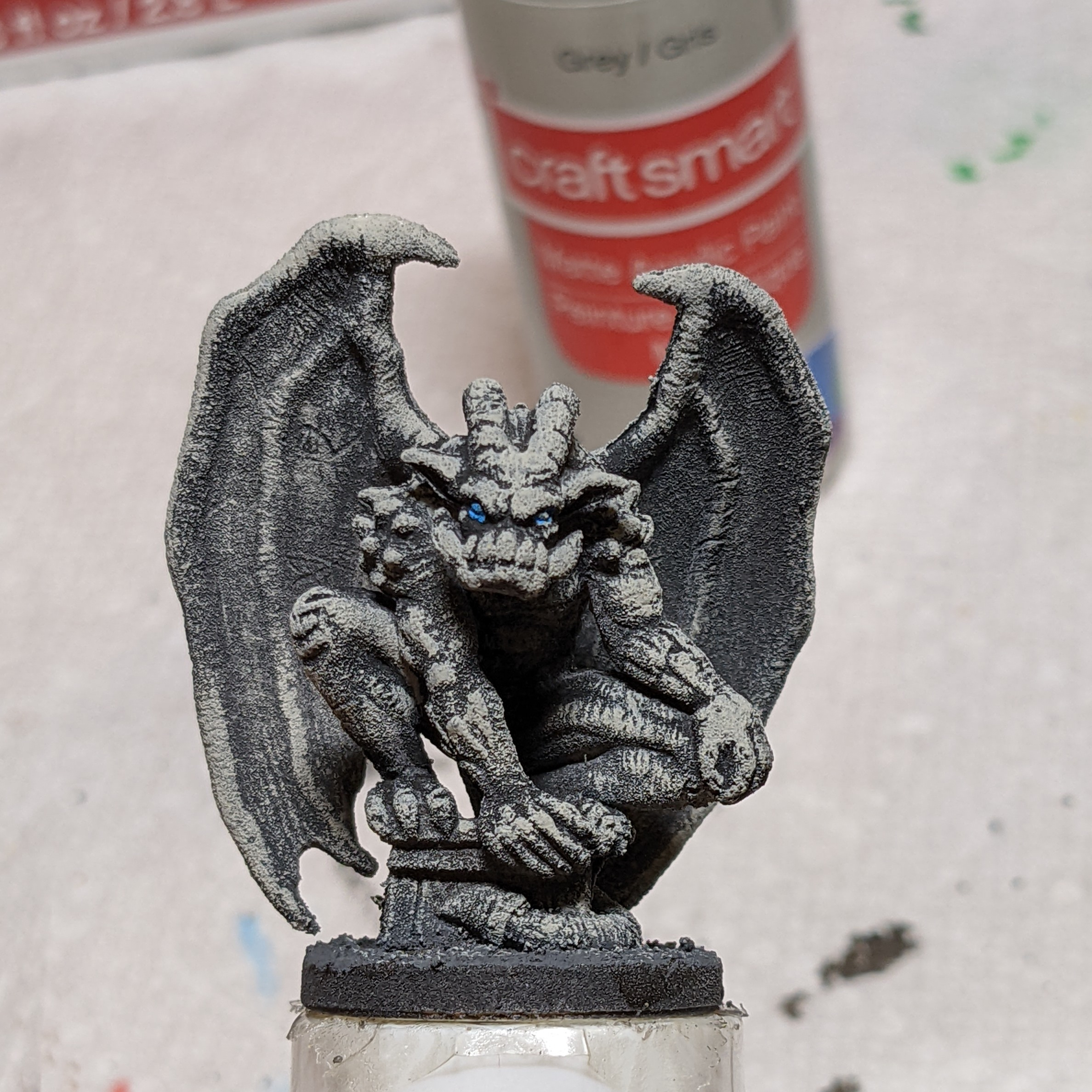
I used Pearl White (a pearlescent, almost metallic paint) on the tops of the wings, tops of the horns, front of the face, ears, and a bit on the knee and hands for the true highlights, which gave a “crystals in granite” type of look to the stone. You could have used plain white if you feel it makes it look too metallic or sparkly.

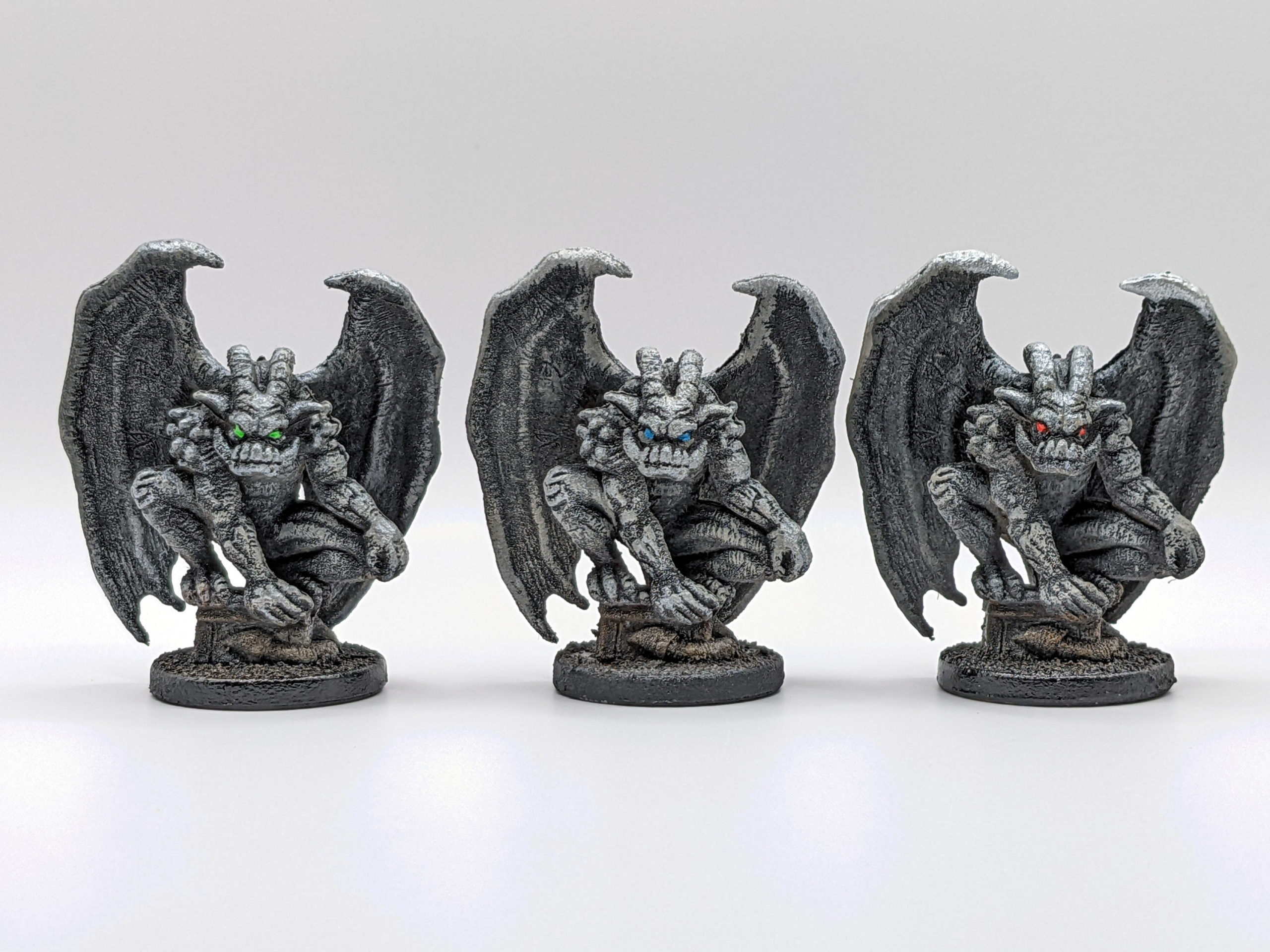
You may notice that I had painted the eyes very early in the process, mostly because I wanted to see how my Liquitex cerulean blue would look. I decided I liked the blue eyes, so I touched them up, and also hit the outside edge of the base with a chalky flat black to hide the brown stains from the burnt umber wash. A light coat of matte clear coat and it was done (see photo at top of page).
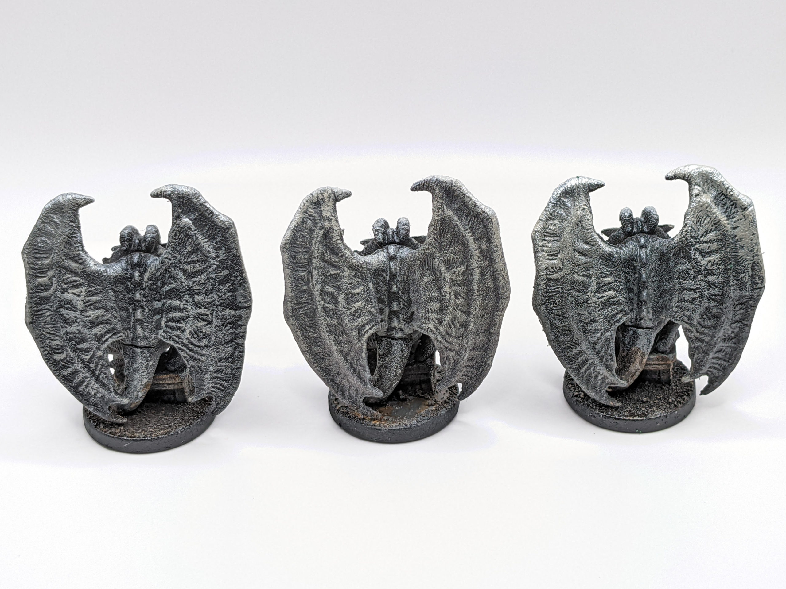
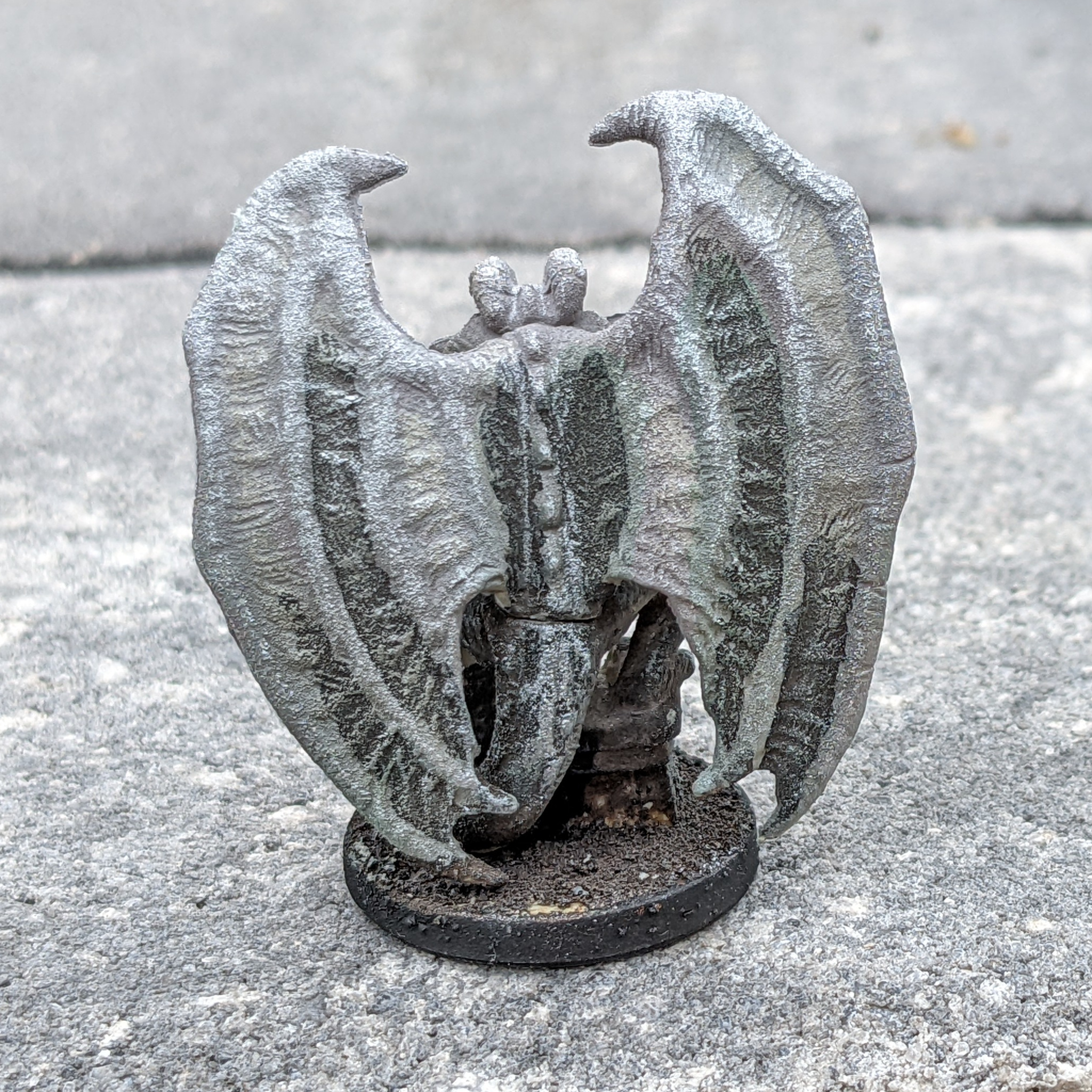
Once I decided on the final color scheme, (and to use a flat black primer), the actual painting went quickly, and most of my time was spent waiting for each color to dry, as the dry-brushing goes relatively quickly. Here is what the back of the figure looks like:
The First Attempt
I haven’t yet re-primed and started over on my first two attempts, but I do feel that starting with a black primer base gives the best visual effect. For my first attempt on the gray primed model, I tried to manually darken the shadow areas by using more burnt umber wash.
And then using watered black acrylic paint to make some areas even darker…
But the divisions between different tone areas were too strong with the washes. I tried dry-brushing some of the transitions a bit to smooth them out, but it didn’t look as good as just starting with a black primer coat. I spent a lot of time fiddling around with various shades of gray to get an only OK result in the end. As you can see, it doesn’t have anywhere near the amount of contrast as my best version above.
Since I wasn’t really happy with the results so far, I started experimenting with a green wash to suggest some moss growing (mostly on the wings).
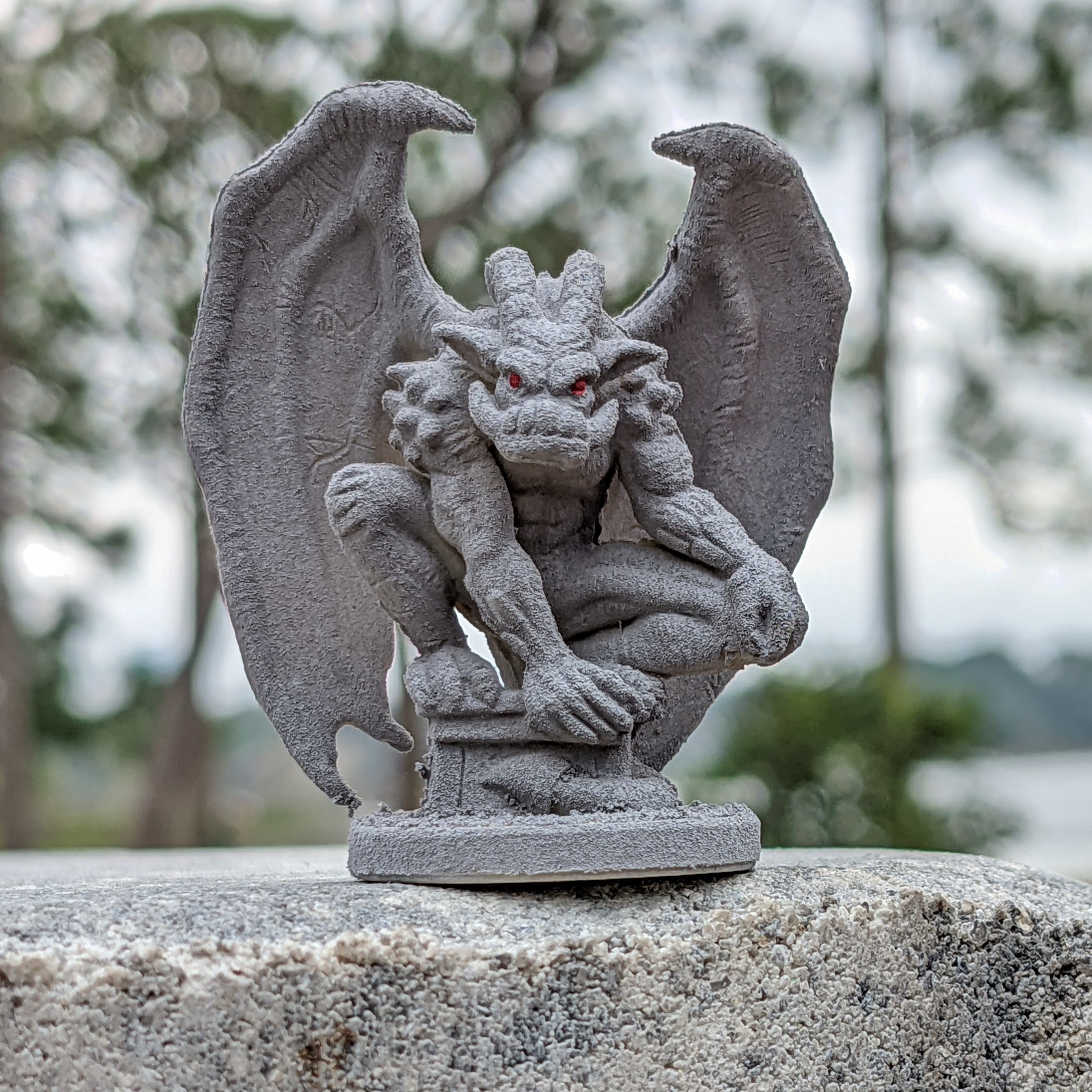
After adding red eyes, the final result isn’t bad, but there was certainly room for improvement.
The things I wanted to improve were more contrast, and better blending between the highlights and shadow regions. I was especially unhappy with the backs of the wings.
The Second Attempt
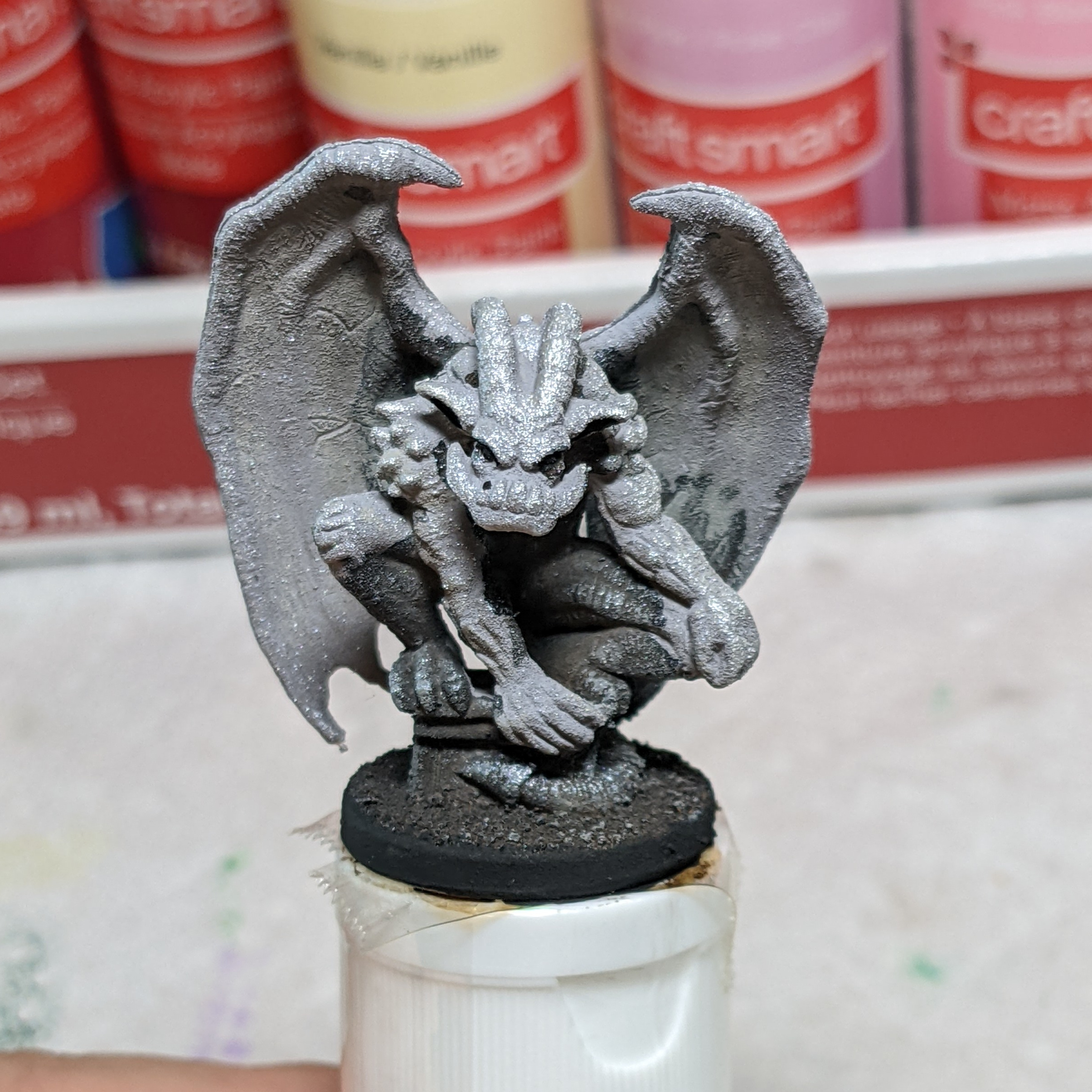
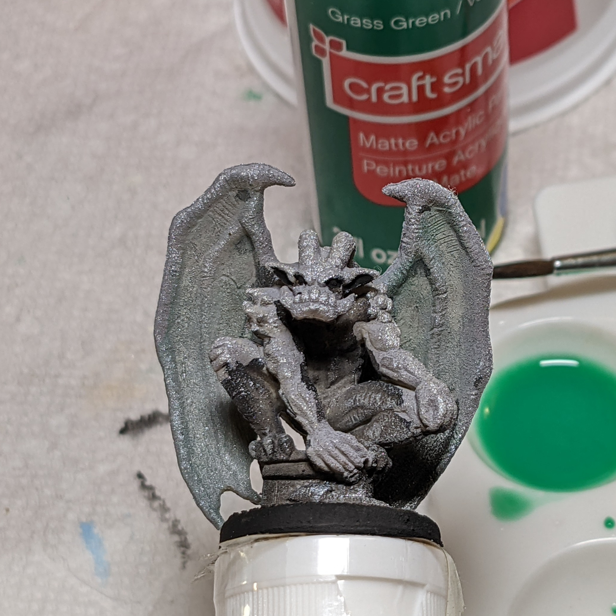
Deciding I needed a lot more contrast, I grabbed my second gray primed model and decided to do shading exactly the wrong way. Yes, I started dry brushing darker colors over lighter colors, making the TOPS of things have “lowlights” instead of “highlights”.
I won’t bother showing you each step, because they basically consist of “dry brush dark gray, a darker gray, and then black on top of everything, and paint the eyes red”.
As you can see, it’s not horrible, but I’d have to offer a backstory about soot covering the gargoyle over time, or one sitting at the top of a tall building at night lit only from below for it to really work. Yes, it looks like a gargoyle, but there is a reason highlights traditionally go up top, and I’m not a good enough artist to break all the rules….
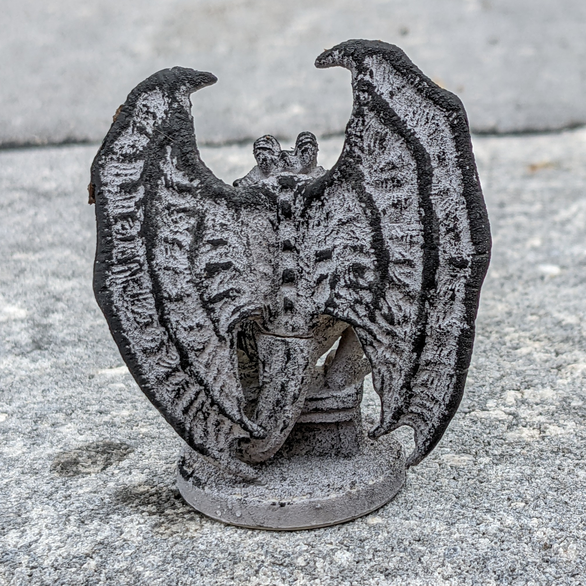
Looking at the back of the wings of my second attempt, I think it looks better than the first attempt, even if the shading is upside down. This view is what convinced me to re-primer my third model in flat black and do the highlights right-side up for my third attempt. I’m still trying to decide if I like having 3 completely differently painted gargoyles, or if I should re-paint one or both of my first two attempts to be closer to the final attempt (perhaps just with different eye colors….).
Update: I decided to spray the first two gargoyles with flat black primer and replicate my “best” gargoyle, here are the results.